An accessibility audit of designmuseum.nl, then a redesign of the worst issues that kept the museum’s identity intact.
Role
Accessibility audit and redesign
Context
NHL Stenden, accessibility sprint
Year
2026
Team
Duo project
Scope
Desktop, against WCAG
designmuseum.nl · 2024
BeforeThe site we audited, as archived in 2024
Redesign concept
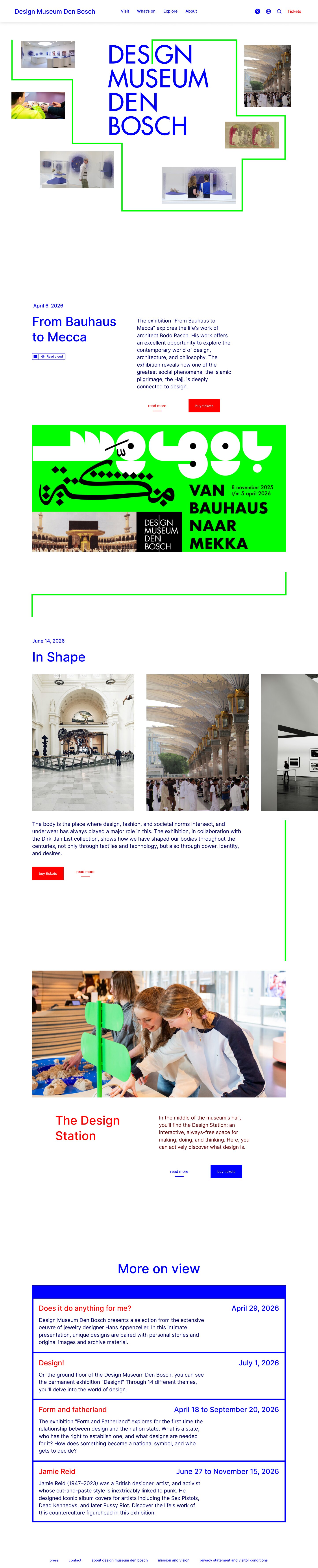
AfterOur redesign
Screens
01
What we found, and what we changed
We audited designmuseum.nl against WCAG, tagged every issue and ranked the issues by effort and impact, then redesigned the worst ones. The originals shown here come from the Internet Archive, 2024.
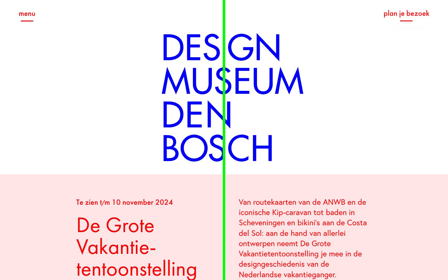
1.1The line gets a job
BeforeThe green line ran through the logo and split every text in two.AfterThe line frames the content and leads from one exhibition to the next.
1.2Photos stay whole
BeforeOn the home page the line ran through every photo, here straight through the TR-808.AfterThe line runs around the images, so the poster can stretch across the whole layout.
1.3Navigation you can see
BeforeEverything sat behind “menu”, even on desktop. On a laptop screen the list was cut off.AfterFour categories are always on screen, next to Tickets, accessibility, language and search.
1.4A blog you can read
BeforeWhite titles on neon green, in three columns.AfterTwo columns on white, so the titles can be read and each article gets attention.
1.5Tickets in one table
BeforeEleven ticket types, each with its own dropdown.AfterOne table with plus and minus buttons, and the five steps numbered above it.
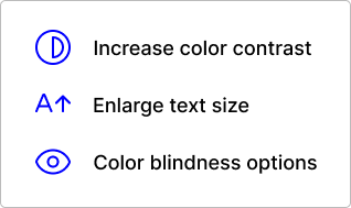
1.6Options in one place
BeforeContrast, text size and colour-blindness options existed only on the ticket pages.AfterOne panel with all three.
Also in the audit
—A screen reader reached about 80% of the content, and read things it should not.
—Buttons that failed WCAG contrast.
—A confusing type hierarchy.
—Large sections only on the Dutch site.
02
How we worked
A duo project. We audited first, then redesigned the worst offenders in Figma and built a prototype of the main flow.